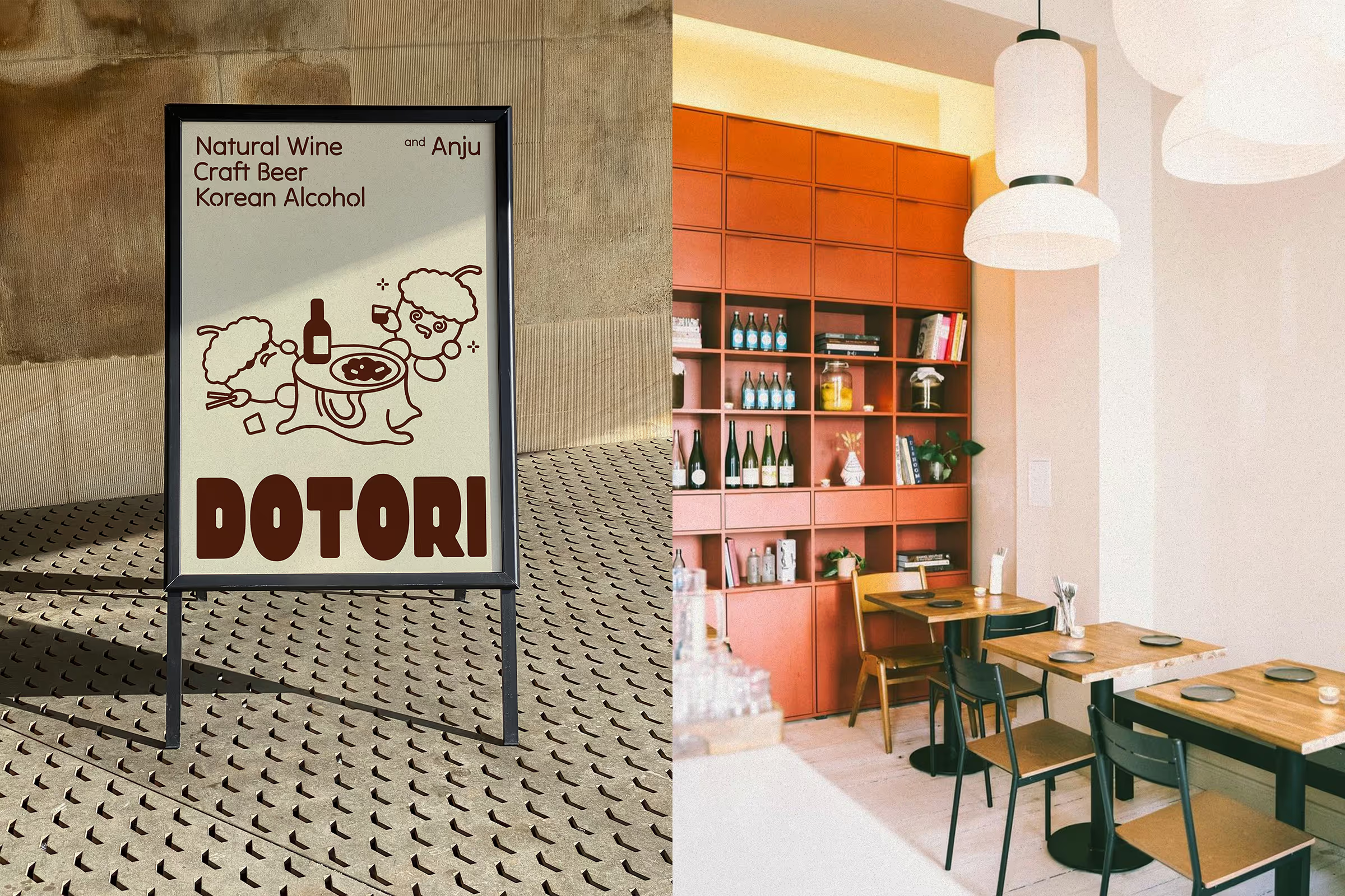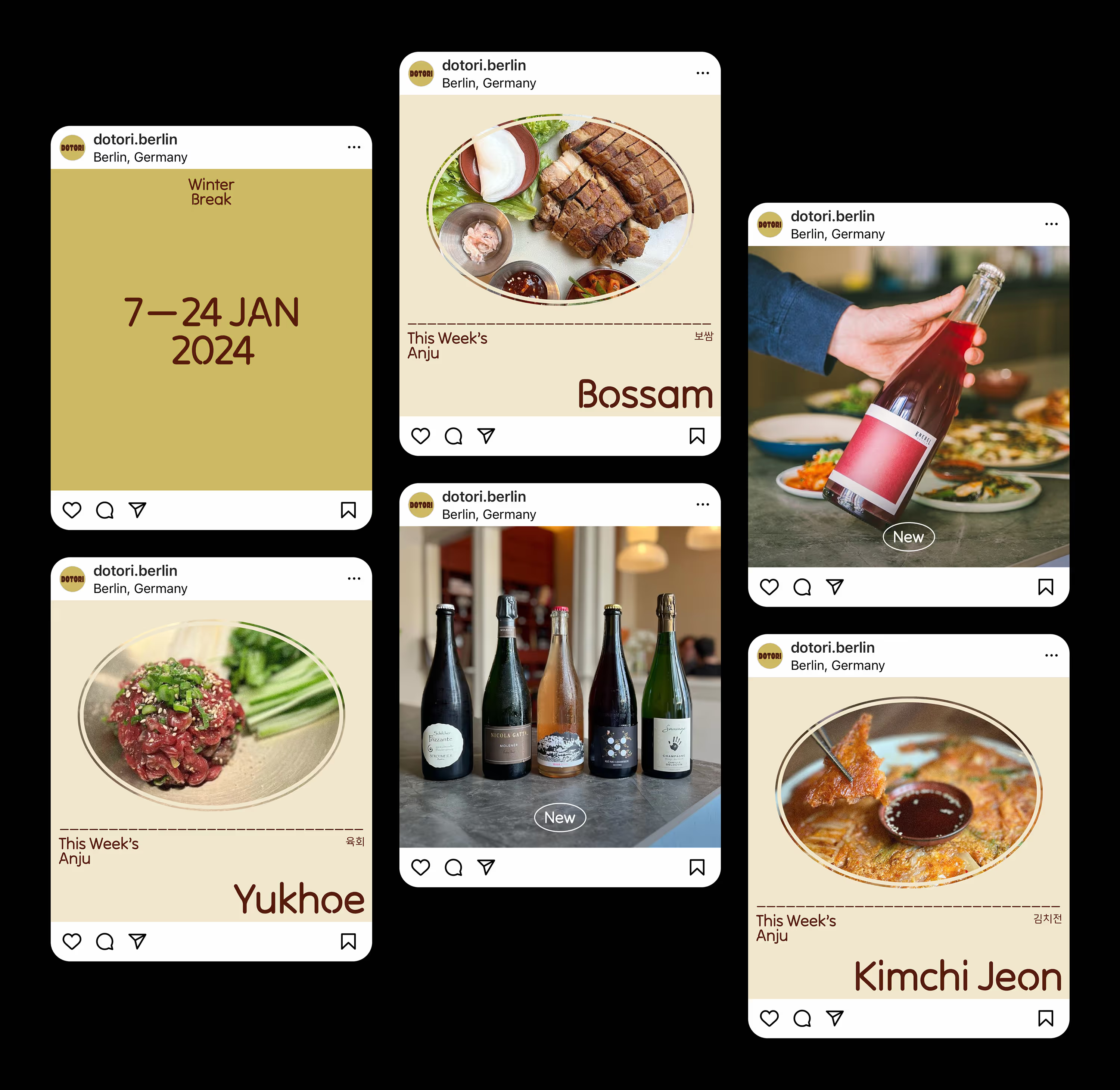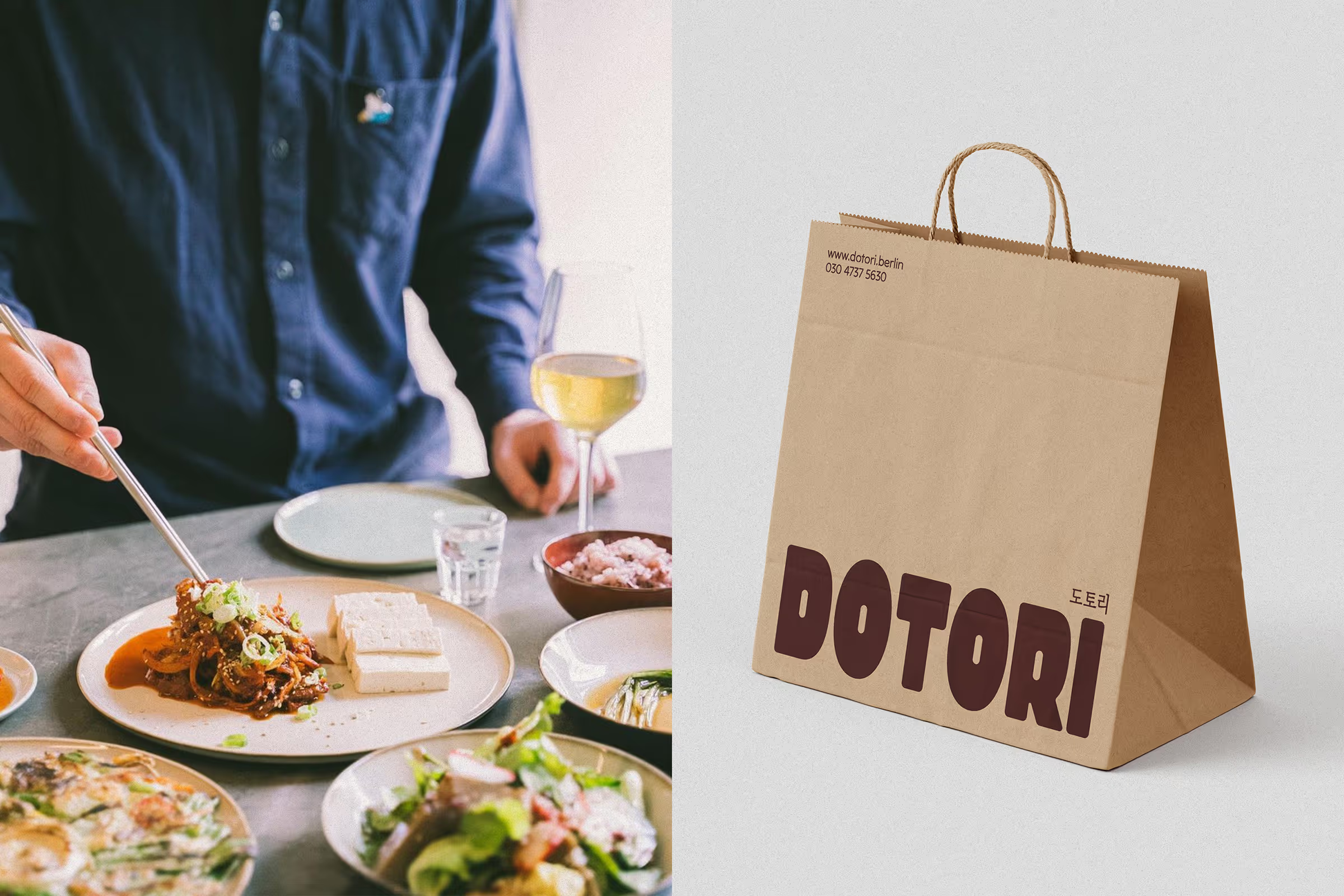

Dotori is a local business located in a quiet residential area in Berlin. As a Korean-style bar, they provide a curated list of natural wines and craft beers alongside traditional Korean alcohols, as well as Anju, which is a type of food enjoyed together with alcohol in Korea.

The client aimed for the bar to be a place where anyone could casually drop by for drinks and small dishes anytime in the evening.
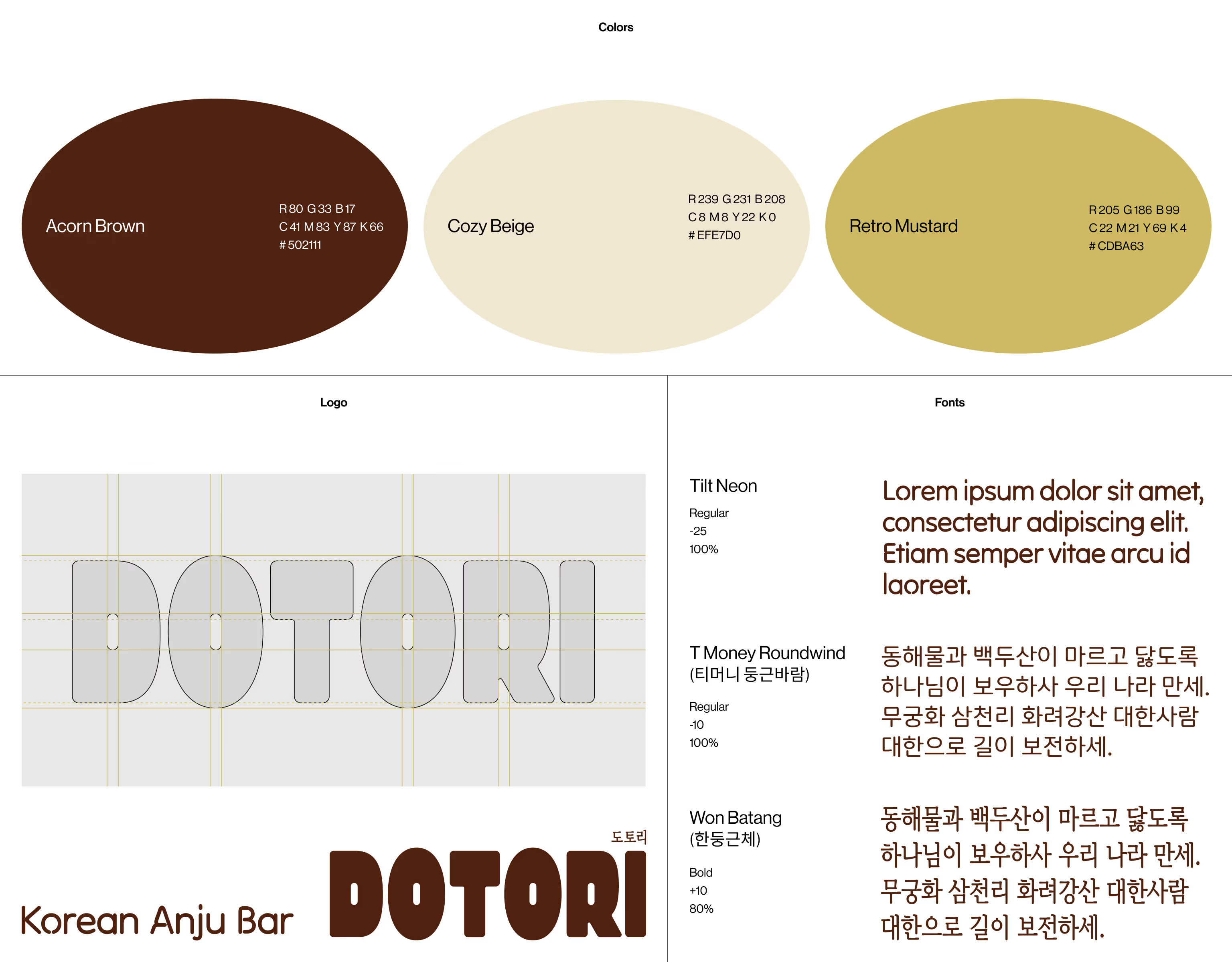
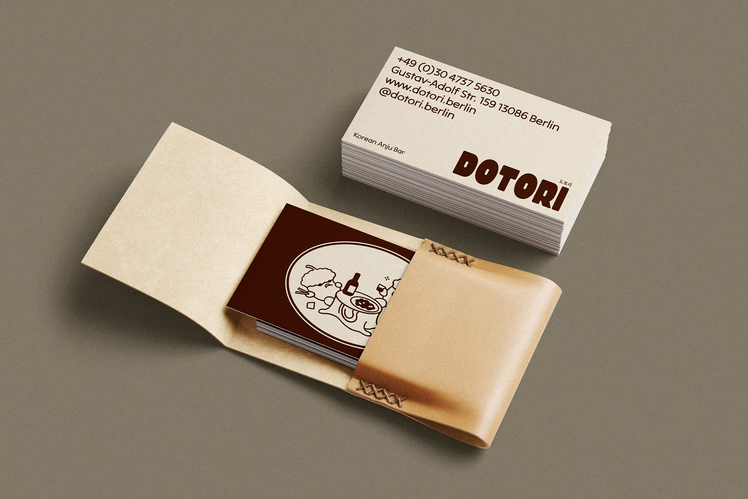
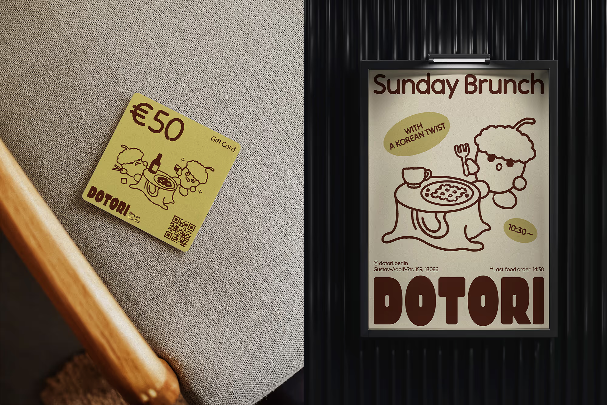
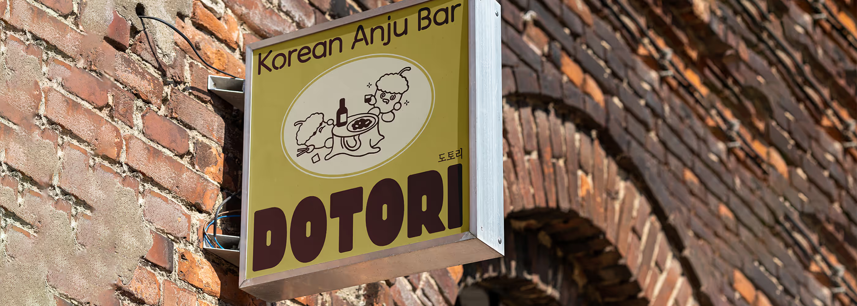
The brand color of a semi-retro style was chosen not only to create a cozy and welcoming visual tone but also to align with the name 'Dotori,' which means acorn in Korean. I avoided using black and white in the color scheme, opting instead for a warm brown palette to provide a soft contrast. The greenish mustard color touch aims to add a playful and sophisticated element to the retro style. In crafting a friendly brand narrative, I created a comic illustration depicting two happily drunk and full acorns enjoying soju and pajeon — typical Korean alcohol and Anju.
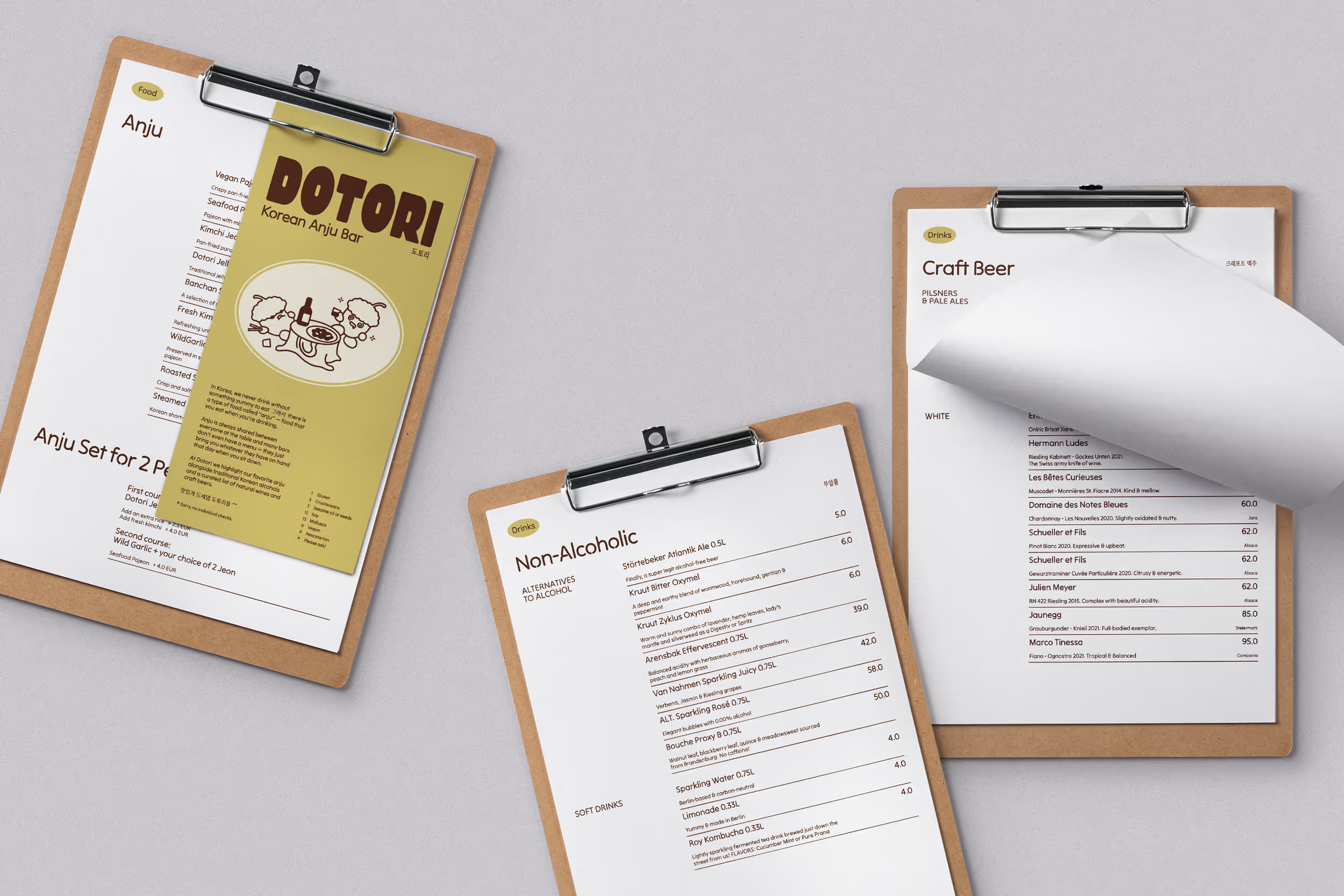
'Anju' is always shared among everyone at the table, and many Korean bars don't even have a menu — they simply bring you whatever they have on hand that day. To maintain this concept, Dotori highlights their favorite Anju, regularly updating the Anju menu. As they need to print the new menu frequently, I divided the menu into two sections. The cover is designed as a hardcover to endure, and for the content page, I provided a layout template in A4 size so they can update it themselves whenever a new menu is needed.
